The outer circle of the Prax logo is reminiscent of the globe and depicts endurance. The inner circle represents a bird’s eye view of an oil storage tank; this lean but incredibly strong structure epitomises the collective strength of the Group. The colour green suggests a connection to nature and the environment, while the name Prax is taken from the first initials of members of the founders’ families.
Our brands
Our Prax family of businesses includes a number of distinct brands. Our downstream businesses carry the Harvest Energy brand, while our midstream and upstream businesses carry the Prax brand. We are collectively identified as the Prax Group.

Our brands
Our Prax family of businesses includes a number of distinct brands. Our downstream businesses carry the Harvest Energy brand, while our midstream and upstream businesses carry the Prax brand. We are collectively identified as the Prax Group.
Prax

Harvest Energy
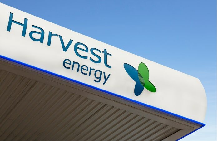
From its origins in 1994, Harvest Energy has become a recognised independent British downstream fuel brand in the retail and commercial sectors. The Group’s refinery provides security of supply and quality products that are competitively priced, supplied and delivered with a strong customer focus.
Harvest Energy is respected as a trusted partner to its dealers and has a growing number of company-owned fuel stations with value-added services, including convenience retail and fast food. It has a distinctive brand identity and a strong market position. Harvest Energy’s commercial customers are comprised of a number of significant blue-chip household names.
Butterflies play a number of important roles in the ecosystem and from ancient times, the remarkable metamorphosis from chrysalis to butterfly has been used to illustrate rebirth and transformation. The Harvest Energy butterfly logo represents the continuous, steady evolution of the business and enhances its environmental credentials.
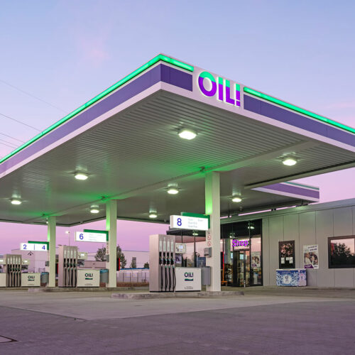
OIL!
Axis Logistics
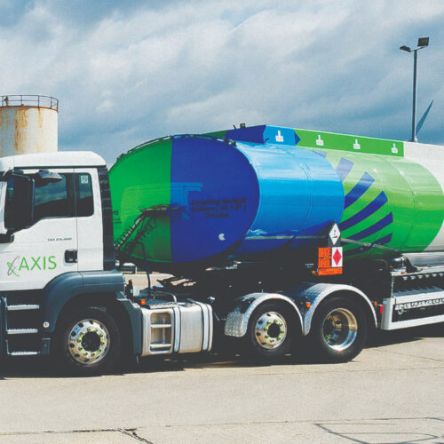
Axis Logistics is the in-house logistics division of the Prax Group. As a global energy conglomerate, an important step was to bring the transportation of fuel from our terminals to our customer sites in-house. The result of this was our global transport company, called Axis Logistics. Efficiency and reliability are the cornerstones of our business, ensuring smooth service and seamless supply to our customers.
Axis Logistics is a seal of approval and a promise of quality and expertise. An axis is the invisible line around which an object rotates, much like the rotating elliptical circles of our logo, which symbolise the speed, power and innovation for which the company is renowned, serving the fast pace and demands of the changing energy industry. The colour green represents our commitment to minimising, as far as possible, our impact on the environment.
Breeze
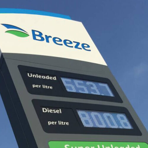
Operating under our Breeze brand, we have a number of unmanned filling stations, which are open 24 hours.
The Breeze logo depicts two leaves, used in different colourways – blue and green – representing the synergies between the brand and Harvest Energy. The leaves suggest a connection to nature and the environment, while the simplicity of the Breeze logo represents the ease and efficiency of using our facilities.
Prax Foundation Roots

The founders of the Prax Group formally established Roots as a UK charitable foundation in 2010. The charity evolved into Prax Foundation Roots in 2022. The name of the charity was inspired by the fact that the founders’ roots are in Sri Lanka, and the charity’s first projects are based there. The Prax Group is the main donor to Roots. The charity is run on a zero-cost basis, with every dollar that the Group donates going directly to it.
The concept behind the design of the Prax Foundation Roots logo is a tree, which has strong foundations and branches made up of the children that the charity supports. The tree represents their personal growth, and the help and support they are offered in order to put down solid roots of their own. It is also reflective of the charity name, which stems from the fact that our trustees have roots in Sri Lanka.
Explore next